A single unanswered question can move mountains of attention. Curiosity is the quiet engine beneath viral headlines, irresistible thumbnails, and the midnight scroll that keeps people clicking. It isn’t just a marketing trick; it’s an ancient cognitive reflex-an itch the mind needs to scratch-and when harnessed thoughtfully it can turn casual browsers into engaged audiences.this article maps how to use curiosity to drive endless clicks without resorting to hollow clickbait. We’ll look at the psychology that makes curiosity contagious, practical headline and content techniques that open the curiosity gap, the formats and channels that amplify it, and the measurement strategies that tell you what’s working. we’ll also flag the ethical boundaries and long-term pitfalls so your approach stays effective rather than exploitative.
Think of this as a field guide: part science, part craft, and part editorial judgment. Read on to learn how to kindle curiosity reliably-and responsibly-so each click becomes a doorway to deeper engagement rather than a dead end.
Design curiosity gaps that promise surprising value and guide the reader to the next click
Think of each headline and first sentence as a tiny promise: a specific, surprising benefit that feels worth a small mental leap. Craft that promise with crispness-one unexpected angle, one clear outcome-and make sure the opening deliverable is immediate. Use micro-deliverables that are quick to consume and harder to resist sharing: a single hack, a counterintuitive stat, or a tiny template. Keep language tight and sensory; when readers can almost picture the result, they’ll click to finish the story. Promise clarity, deliver surprise.
- One small reveal: Give just enough to prove value.
- Concrete payoff: State what changes after the click.
- low friction CTA: offer a clear next step (e.g., “See the quick trick”).
| Tease | Promise | Next Click |
|---|---|---|
| “One overlooked metric” | Boost conversions without new traffic | Case study + checklist |
| “3-word headline hack” | Double open rates in a week | Swipeable examples |
Design the path forward like a kind map: hint at the next insight, show a tiny preview, and make the click feel like a natural step rather than a gamble. Use anchor copy that echoes the benefit (“Reveal the template,” “Show the before/after”), and reinforce trust with micro-evidence-screenshots, short quotes, or a timestamped case note. Small UX cues (progress bars, numbered steps, inline previews) convert curiosity into action by reducing perceived risk. Make the next click feel unavoidable and rewarding.
Use emotion and specificity to craft irresistible teasers without resorting to false promises
Tap into what people feel-fear of missing out, relief, amusement-and pair that with crisp details that satisfy curiosity.Instead of vague teasers that promise everything, offer one clear payoff: a number, a moment, a sensory hint. Try these quick moves to make your snippets magnetic and honest:
- Quantify: swap “big savings” for “save 37% this weekend.”
- Humanize: show a tiny scene: “a tired founder at 3 a.m. who fixed it.”
- Ground claims: cite a source or timeframe: “verified in 48 hours.”
Balance emotion with verifiable detail so curiosity leads readers to click, not to feel tricked.
Turn temptation into trust by avoiding extravagant guarantees and replacing them with precise hooks that tease an honest reveal. For example:
- Overblown: “This trick will change your life!” → Curious & true: “One tweak that saved my commute 12 minutes/day.”
- Vague: “you won’t believe this result!” → Curious & true: “How one spreadsheet cut our reporting time in half.”
When your language matches what you deliver-emotive but specific-you create a loop: intrigue, click, satisfaction, and repeat engagement without ever resorting to false promises.
Optimize microcopy, thumbnails, and visual cues to seed questions and lower the cost of clicking
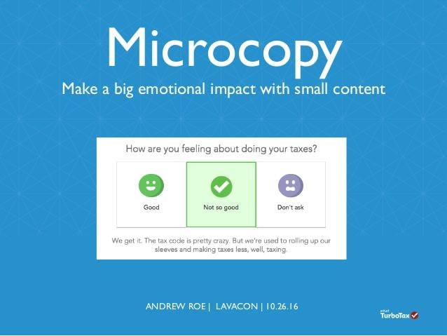
Tiny words can do heavy lifting. A three-word tooltip or a playful button label turns passive browsing into a faint zap of curiosity – the mental nudge that lowers the perceived cost of clicking.Craft microcopy that hints at an insight rather than delivering it: “The one tip that changed X,” “Why this failed,” or “You won’t expect this.” Pair those lines with subtle affordances (soft shadows, hover states, micro-animations) so users feel invited, not tricked. The goal is to seed a question in the reader’s mind - not answer it - and make the act of clicking feel like the smallest, most natural next move.
Thumbnails and visual cues amplify that seeded question. Use cropped close-ups, partial reveals, or a human face in motion to create visual tension; add tiny badges or arrows to direct attention and reduce decision friction. Test contrasts, framing, and the amount of revealed details until the image + caption combo reliably spawns an internal “what happens next?” Use A/B tests to measure the drop in hesitation and iterate until curiosity becomes a cost-effective acquisition channel.
- Microcopy: tease, don’t explain.
- Thumbnails: show a slice,not the full story.
- Visual cues: guide the eye, then leave the mind hungry.
| Microcopy | Thumbnail | Seeded Question |
|---|---|---|
| “One trick pros use” | Hand partially covering an object | “What trick?” |
| “You did this wrong” | Close-up of a surprised face | “How did I mess up?” |
| “This changes everything” | Light beam highlighting a single detail | “What changes?” |
Build modular sequences of linked content that reward exploration and increase session depth
Think of your site as a constellation of short, clickable stars: each piece of content is a self-contained spark that hints at a larger truth and points to the next bright node. Design modules to end with a tiny revelation or an unexpected data point that can only be fully understood by visiting the adjacent page.Use tags and intent-based URLs to assemble dynamic chains so the path changes with user behavior – the same content can sit in multiple sequences, rewarding repeat explorers with new angles. Make each click feel like a discovery, not a transaction.
- Micro-stories: 60-150 word modules that resolve gently and tease a follow-up
- Branching teasers: two short links labeled “Want the origin?” or “Show the demo”
- Progress tokens: visual badges that unlock a concise bonus article
- Contextual breadcrumbs: micro-previews on hover that promise a payoff
- Cliffhanger CTAs: a single-question prompt that rewards the next click
Track depth by measuring the average number of modules per session and the drop-off point in each chain; iterate on the hooks that precede the biggest losses. Pair behavioral triggers with lightweight personalization so the sequence adapts: a curious reader sees a different next step than a return visitor. Small, modular rewards compound into long sessions.
Measure curiosity with engagement signals, run split tests, and refine hooks based on real behavior

Numbers become the compass for curiosity when you stop guessing and start watching. Track micro-behaviors – dwell time, scroll depth, hover pauses, repeat visits – and stitch them to outcomes with event tracking and session recordings. Focus on real behavior, not flattering surveys: a long dwell time or repeat click is a clearer signal of intrigue than a thumbs-up. Use cohort comparisons to see which hooks create lasting curiosity versus quick bounces, and prioritize tests that move both engagement and micro-conversions.
- Time on page – how long curiosity holds attention
- Scroll depth – whether the hook sustains interest
- Secondary clicks - evidence of deeper exploration
- Repeat visits - signals of ongoing intrigue
| Signal | What it tells you |
|---|---|
| CTR | Initial curiosity strength |
| Scroll 50%+ | Hook delivers on promise |
| Repeat Visit | Long-term intrigue |
| Secondary Clicks | Depth of engagement |
Let those signals drive a disciplined testing loop: run A/B and multivariate experiments on headlines, thumbnails, and the first 12 words, then refine the winning hooks and re-deploy them across channels. Design experiments to answer one question at a time, measure both immediate and downstream effects, and favor variants that nudge real behavior – not just vanity metrics. Over time,this behavioral feedback loop turns curiosity into a predictable,repeatable engine of clicks.
- Headline variants: curiosity-gap vs. clarity
- Visual vs. text-first thumbnails
- Opening-line tests: tease vs. explain
- CTA wording: passive vs. provocative
Maintain credibility by balancing mystery and clarity and ensuring every click delivers clear value

Tease just enough to spark interest, then honor that curiosity the moment a visitor arrives. The trick is to pair a tantalizing hook with a visible, honest pathway to value-so the click feels rewarded, not duped. Use micro-promises that preview the benefit and then deliver it within seconds: a concise payoff line, a clear subhead, or a highlighted takeaway. When readers find the reward quickly, trust grows and clicks become a conversation rather of a trap.
- One-line payoff: state the benefit upfront
- Clear teaser: hint, don’t mislead
- Instant value: surface an answer above the fold
- Consistent signals: align headline, meta, and first paragraph
Measure and safeguard credibility by treating every click as a promise to be kept: audit titles against content, track time-to-first-value, and use microcopy to calm buyer anxiety. Small UX gestures-bolded takeaways, clear next steps, and fast-loading content-convert curiosity into satisfaction. The simplest governance tool is a tiny checklist or table that maps what a reader expects to what they actually receive; that alignment is the engine that turns repeat curiosity into ongoing engagement.
| Stage | Expectation | Quick Fix |
|---|---|---|
| Before click | Clear, enticing benefit | Headline + meta align |
| After click | immediate, relevant payoff | Answer above the fold |
Key Takeaways
Think of curiosity as a precise instrument rather than a blunt force: when finely tuned, it guides readers toward real value rather of baiting them into empty clicks. Use intrigue to pose useful questions, frame promises clearly, and lead with content that satisfies the interest you spark. Measure responses, iterate on what genuinely engages, and never trade trust for a momentary spike in traffic.
In practice, that means pairing tempting hooks with honest previews, testing microcopy and formats, and respecting the reader’s time and attention. Do this, and curiosity becomes less a tactic and more a sustainable engine for discovery-one that drives clicks while building relationships and credibility that last.