Half of what we start never gets finished. From half-built apps and abandoned courses to furniture still waiting for that final screw, unfinished products aren’t just a nuisance – they’re a signal. They tell us somthing went wrong long before the finish line: not with users, but with the product’s design.
The secret to creating products people actually finish isn’t a trick or a motivational poster. It’s a discipline: designing for completion. That means thinking less about capturing attention and more about shepherding a person across a clear,compelling path from first use to final step. It’s the difference between opening a door and building a hallway that gently guides someone through it.
This article will unpack what that hallway looks like in practice. We’ll look at how clear goals,tiny wins,friction removal,and feedback loops create momentum; how social and temporal cues help maintain it; and how defining the end state-and making it visible-changes behavior. No hype,just design choices that turn starts into finishes.
If you care about outcomes more than launches,the next pages will show how to design products that don’t just attract users,but carry them all the way through.
Design for an immediate win that sparks momentum
Give people a tiny victory right away – a first milestone that feels complete within seconds, not hours. When the product hands over a clear, tactile result (a badge, a saved draft, a visible change), users register progress and are far more likely to take the next step; the key is to make that first outcome obvious and delightful without demanding skill or time. Think in terms of micro-behaviors: small decisions, immediate feedback, and cues that celebrate completion.
- Start with a single, irresistible first task that takes under 60 seconds
- Use micro-feedback (sound, animation, copy) to confirm success
- Chain the next action so it’s slightly greater but still achievable
| Micro Task | Time | Instant Reward |
|---|---|---|
| Pick an avatar | 15s | Profile looks complete |
| Save a template | 45s | Can reuse instantly |
| send a hello message | 30s | Conversation starts |
That early success becomes the engine of momentum: onc someone experiences a clear payoff, their attention and confidence rise, making them receptive to slightly tougher commitments. Use that momentum to guide a gentle escalation of challenges and keep the interface signaling progress at every turn – small wins stacked one after another create a compounding effect that turns casual users into finishers.
Restrict options and intentionally shape user choices
People finish what feels unavoidable, not what feels infinite. By trimming the menu of possibilities you turn vague intentions into tidy, actionable steps - the same way a narrow trail is easier to follow than an overgrown field. Use constraints as a design language: they are not limitations but signals that highlight what truly matters. Focus becomes the product’s most persuasive feature, and completion becomes the natural endpoint rather than a rare achievement.
- Limit paths: present a small set of curated options (2-4) instead of every conceivable route.
- Default wisely: preselect sensible choices so users expend decision energy on what matters.
- Scaffold progress: convert big decisions into micro-steps that build momentum.
Designers should treat these restrictions as testable hypotheses: measure how each constraint moves completion,iterate on the ones that increase momentum,and abandon the ones that feel coercive. Combine quantitative signals (completion rate, time-to-task, drop-off points) with speedy qualitative checks (micro-interviews, session replays) to ensure you’re guiding, not forcing. When done well, intentionally shaped choices feel helpful – a gentle hand that keeps people moving toward a satisfying finish.
chart the completion journey with micro milestones and clear progress cues
Break the finish line into many tiny gates – not becuase users need hand-holding, but because our brains love small wins. Each micro milestone should feel like a real accomplishment: a single decision made, a form step completed, a short task checked off. Pair those gates with immediate,unmistakable cues (visual ticks,color shifts,brief celebratory copy) so progress becomes both visible and rewarding. When the path is broken into predictable, bite-sized moments, inertia collapses and completion becomes the natural next click.
- Micro check-ins – short confirmations after each step
- Segmented progress bars – show meaningful segments, not percent noise
- Micro-copy rewards – one-line celebration or tip after a milestone
- Persistent anchors – small icons or badges that signal overall progress
| Cue | Why it helps |
|---|---|
| Checkmark | Signals completion, boosts momentum |
| Segmented bar | Reduces uncertainty |
| Celebratory line | Reinforces the habit loop |
Ship these cues with intention: make them visible, frequent, and meaningful. Aim for milestones that take roughly 2-10 minutes or one clear decision; wire conditional logic so cues appear only when deserved, and A/B test how celebratory copy or color shifts affect completion rates. Small,well-timed signals create a completion rhythm – users start recognizing the beat,and finishing stops feeling like a marathon and starts feeling like a series of tiny,inevitable victories.
Build feedback loops and habit triggers that reward steady progress
Think of your product as a gentle coach: it notices small wins and hands out tiny, immediate confirmations so users hear the message “you’re moving forward.” Instead of one dramatic finish line, sprinkle compact, meaningful signals – a brief animation, a subtle sound, a numeric nudge – every time someone completes a bite-sized step.These micro-feedback loops condition behavior without nagging; when progress is visible and reliably rewarded, users build momentum. Small, consistent rewards create habits far more reliably than rare, big incentives.
- Micro-rewards - celebrate tiny completions (checkmarks, XP, unlocked color).
- Progress markers – show distance to the next meaningful milestone (25%, 50%).
- Trigger cues – connect actions to daily anchors (morning, commute, break).
- Adaptive timing - space reinforcements so they remain desirable, not expected.
Design triggers that slot into existing habits and pair them with simple, fast gratification: a cue in the environment, a frictionless entry, and a brisk reward.Below is a quick reference you can use to prototype triggers and their smallest viable rewards.
| Trigger | Mini-Reward | Effect |
|---|---|---|
| Morning coffee | 1 quick task check | Easy momentum |
| Post-exercise | Streak badge | Motivation boost |
| Idle screen | Personal tip | Return prompt |
Remove friction with templates,smart defaults and progressive disclosure
When users reach a product, they rarely want an instruction manual-they want momentum. Thoughtful templates give people a ready-made path; smart defaults reduce decision fatigue by choosing reasonable options for the majority; and revealing features gradually preserves focus while letting curiosity grow. Treat these elements as design choreography: set up the first move with a starter template, keep the next steps obvious with sensible defaults, and only introduce advanced controls when someone is clearly invested.
- Starter templates: short, focused, and editable so users land in a useful state instantly.
- Contextual defaults: pull from user data and common patterns to prefill choices.
- Progressive reveal: hide advanced settings behind clear affordances rather of burying them.
- Micro-commitments: break flows into tiny wins that make finishing feel inevitable.
Applied together,these tactics transform friction into momentum: completion rates rise,onboarding time drops,and users feel accomplished rather than tired. Measure changes with small experiments-A/B templates, default variants, staged reveals-and iterate on the combinations that turn tentative starts into finished work consistently.
Validate finishing through rapid prototypes and time box experiments
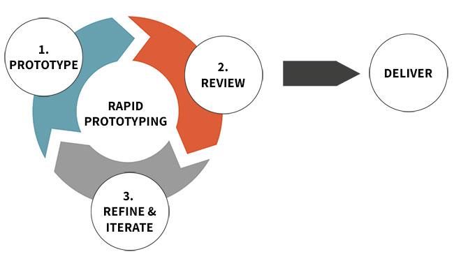
Build the smallest believable thing that proves people will actually reach the end.Start with a lean mock that focuses on the moment someone clicks “done” – the interfaces, nudges, and tiny rewards that coax completion. Use prototypes as a conversation: watch how real users move through the flow, listen for friction, and collect concrete signals like abandonment points, time-to-complete, and whether they return. Treat every prototype as a measurement tool, not a polished product; the goal is learning about finishability, fast.
- Clickable mock: test the flow without building backend logic.
- wizard of Oz: fake automation to see if users care about the result.
- Feature toggle: roll out a minimal finish-path to a subset and measure uptake.
Work in short, tightly scoped time boxes that define a hypothesis, a metric, and a clear success threshold before you build. Run each experiment for a fixed period, gather quantitative completion rates and qualitative notes, then decide: pivot, persevere, or kill. This rhythm turns intuition into evidence - a repeated cycle of small bets that reveal which patterns actually lead people to finish. Make the finish measurable, and make decisions based on that measurement.
| Experiment | Duration | Success Metric |
|---|---|---|
| Click-through mock | 3 days | Complete rate ≥ 40% |
| Wizard of Oz finish | 1 week | Repeat usage within 7 days |
| Feature toggle demo | 2 weeks | Drop-off < 25% |
To Wrap It Up
The secret isn’t a trick or a single silver-bullet feature; it’s a deliberate design choice: treat completion like a product requirement. When you make the end easy to find and meaningful to reach – by chunking work into clear, valuable steps, removing needless friction, and giving people frequent feedback and reasons to keep going - you change behavior at scale. Small wins, obvious progress, and a visible finish line turn vague intentions into finished things.
That choice asks you to be ruthless about scope, generous with guidance, and curious about real user journeys.Test, observe, and iterate not just on features but on the paths people take to the end. In doing so you stop betting everything on motivation and start designing completion into the experience.
If you want products people actually finish, design the ending first. Finish is not an accident; it’s a feature you can build.