In a world where first impressions are often crafted in mere seconds, the significance of a logo in representing a business cannot be overstated. It serves as the visual cornerstone of a brand,encapsulating its values,mission,and personality in a simple yet powerful image. but what does your logo truly convey? Is it merely a decorative emblem, or does it hold deeper meanings that resonate with your audience? In this article, we will delve into the multifaceted role of logos, exploring how design choices-color, shape, and typography-can communicate your business’s essence and influence perceptions. Join us as we unravel the intricacies of logo design and discover what your logo is really saying about your business.
The Unspoken Language of Colors and Shapes
Colors and shapes hold an extraordinary power, creating an emotional resonance that speaks to your audience even before thay read a single word. For example, while red might evoke passion and energy, blue often signifies trust and dependability. The choice of shapes also speaks volumes; circles can convey harmony and unity, whereas sharp angles might suggest innovativeness and dynamism. This subtle yet impactful interaction is central to effective branding, allowing businesses to establish an immediate connection with their target market. As potential customers encounter your logo, they are subconsciously interpreting these visual cues that form their perception of your brand.
In the quest to create a memorable identity, it’s essential to harmonize your logo’s color palette with its shapes. Here’s a rapid guide on what specific combinations can imply:
| Color | Shape | message |
|---|---|---|
| Green | Circle | Growth & balance |
| Yellow | Triangle | Creativity & innovation |
| Purple | square | Luxury & quality |
| Orange | Wave | Energy & enthusiasm |
By carefully selecting the colors and shapes used in your logo, you are not merely crafting a visual symbol; you are telling a story about your brand’s values and mission. These choices can create a lasting impression,distinguishing your business from competitors while also inviting your audience to engage and reflect on what your brand embodies.
Decoding Symbolism: What Your Logo Represents
Logos are more than just pretty designs; they are visual manifestations of a brand’s ethos,personality,and mission. Each element of a logo can convey a multitude of meanings, contributing to the overall perception of your business. The choice of color can evoke emotions-red for excitement,blue for trust,and green for growth. Additionally, the font style can suggest a particular vibe; as an example, a modern sans-serif might indicate innovation, while a classic serif could convey tradition.Together,these elements work harmoniously to create a first impression that aligns with the intended message of your brand.
Consider these critical aspects when evaluating your logo’s symbolism:
- Colors: Different hues impact emotional responses.
- Shapes: Circular logos frequently enough imply unity, while angular designs may suggest stability.
- Typography: The right font can enhance readability and reinforce brand identity.
- Imagery: Icons or symbols can clarify the nature of your business and its values.
Let’s take a closer look at how these elements can be represented:
| Element | Symbolism |
|---|---|
| Color | Emotion & mood evocation |
| Shape | interpretation of stability or fluidity |
| Font Style | Reinforcement of legacy or innovation |
| Imagery | Clarity of business essence |
Crafting Identity: The Role of Typography in Your Logo

When it comes to logo design, typography isn’t merely an aesthetic choice; it’s a powerful communicator that encapsulates the essence of your brand. The font style,size,and spacing each carry emotional weight,shaping perceptions long before a single word is read. Consider how a sleek,sans-serif font might evoke modernity and efficiency,while a classic serif could convey tradition and reliability. Each typeface tells a story, whispering hints about your brand’s personality to those who encounter it. By choosing the right typography, you set the stage for the first impression, creating a visual narrative that resonates with your target audience.
Moreover, an effective typographical choice can enhance brand recognition and recall. A well-designed logo with distinct typography can become an integral part of your brand identity, as it not only differentiates you from competitors but also creates an emotional connection with consumers. Here are a few considerations to keep in mind:
- Legibility: Ensure your typography is easy to read across various mediums.
- Alignment with brand values: Choose fonts that reflect what your business stands for.
- consistency: Maintain typographical styles across all marketing platforms to reinforce brand identity.
Versatility and Scalability: Ensuring Longevity in Design
In an ever-evolving business landscape,a logo needs to be more than just a visual identifier; it must be a symbol of adaptability. The most effective logos exhibit versatility by easily scaling across various platforms and mediums, from digital advertisements to physical merchandise.A well-designed logo should maintain its integrity and clarity, weather it appears on a business card, website, or billboard. This versatility not only ensures immediate recognition but also encourages a connection with a diverse audience. When contemplating your logo, consider its ability to:
- Function in both color and monochrome
- Adapt to different backgrounds
- Retain recognition in varying sizes
- Incorporate different design styles without losing essence
Scalability is equally essential, as it allows a logo to grow with your brand. A logo that can evolve while staying true to its core design is a powerful asset, reflecting stable growth and progressive values in the face of changing market conditions. To assess your logo’s scalability, ask yourself:
| Consideration | Implication |
|---|---|
| Will it still look good on a small mobile screen? | Ensures accessibility across devices |
| Can it be expanded for larger displays without losing detail? | Maintains brand visibility in various formats |
| Does it convey the same message at different sizes? | Consistency in brand perception |
Consistency in Branding: How Your Logo Ties Everything Together
A logo is more than just a visual emblem; it serves as the foundation of your brand’s identity. It communicates essential characteristics about your business, conveying messages of trustworthiness, innovation, or luxury at a glance. A well-designed logo should embody the essence of your brand, acting as a convergence point for your company’s values, mission, and vision. It brings together various elements of your marketing strategy, ensuring a unified presentation across all platforms. Here are some key aspects:
- Brand Recognition: A unique logo enhances memorability, making it easier for customers to identify your business.
- Emotional Connection: Colors and shapes evoking certain feelings can create a bond with your audience.
- Professionalism: An aesthetically pleasing logo suggests credibility, reinforcing consumer trust.
Furthermore, consistency in your logo’s request across various mediums creates a cohesive brand experience. From your website to social media and offline advertising, maintaining the same logo ensures that your audience perceives a unified vision. In contrast, inconsistent logo usage can confuse potential customers and dilute your brand identity. Consider the following elements when applying your logo across platforms:
| Medium | Logo Adjustment | Key Consideration |
|---|---|---|
| Website | Transparent background | Ensure visibility on all backgrounds |
| Social Media | Circular crop | Maintain brand presence across profiles |
| Print Ads | High-resolution version | Ensure clarity and professionalism |
Test and Evolve: The Importance of Seeking Feedback
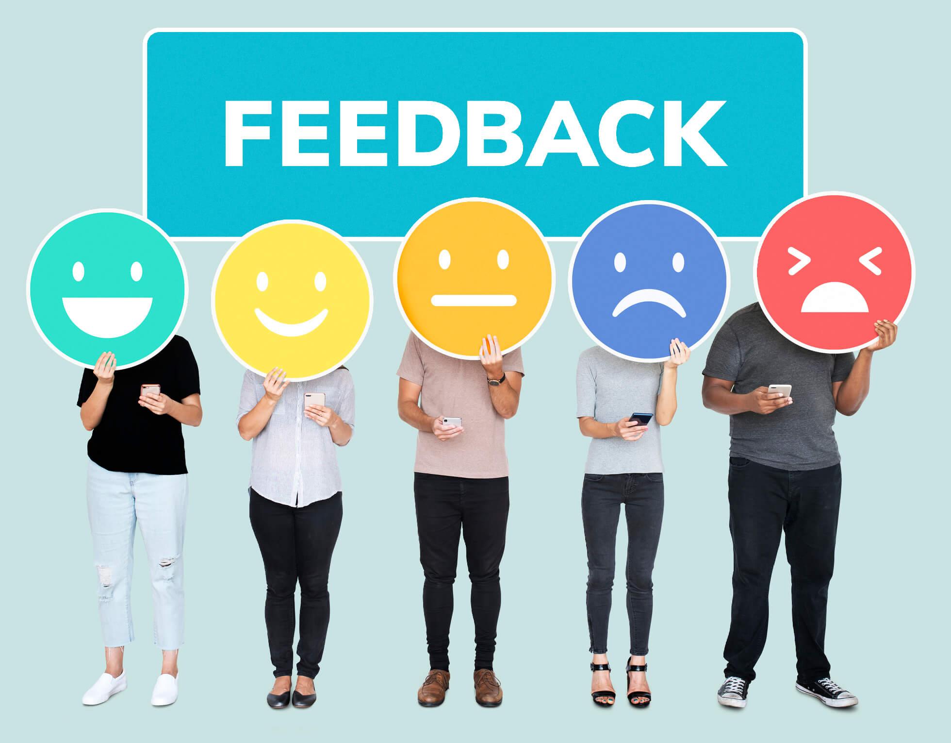
In the dynamic world of branding, the feedback cycle is indispensable. Engaging with your audience provides deep insights into how your logo is perceived and its effectiveness in conveying your core values.Reach out through surveys, social media, or focus groups to gather diverse perspectives. This details can help you understand the emotional response elicited by your design and whether it’s translating the intended message. You might discover that your logo evokes unexpected feelings or associations, leading to crucial adjustments that align it more closely with your brand identity.
Moreover, the iterative process of design and feedback allows for continuous improvement, fostering innovation and relevance. As markets evolve, so do consumer preferences, making it essential to adapt your branding strategy. Consider implementing a regular review process for your logo, incorporating insights gathered to create revised iterations that resonate with your audience.Here are some key benefits of this approach:
- Enhanced customer connection: Understanding audience sentiment helps forge a stronger emotional bond.
- Alignment with trends: Adapting to current aesthetics keeps your brand fresh and engaging.
- Positive brand perception: Continuous evolution can improve customer loyalty and brand reputation.
Avoiding Common Pitfalls in Logo Design
When embarking on the logo design journey,it’s essential to steer clear of frequent missteps that can dilute your brand’s message. One common mistake is overcomplicating the design. A logo should be easily recognizable, and intricate designs may confuse or overwhelm potential customers. Simplicity often leads to memorability; think of brands like Nike and Apple, which have effective logos that are straightforward yet iconic. Another pitfall to watch for is ignoring versatility. Your logo will appear across various mediums-from business cards to billboards-and it must retain its integrity whether in black and white or color, vector or raster formats.
Additionally, a crucial consideration is the choice of color palette. Each hue evokes different emotions and associations, so it’s vital to research color psychology relevant to your industry. For example, blue often conveys trust and professionalism, making it a popular choice for financial services, while green suggests growth and health, ideal for eco-friendly brands.don’t underestimate the power of feedback; gathering opinions from potential customers or focus groups can provide invaluable insights, helping ensure your logo resonates with your target audience. Ultimately, a triumphant logo is more than a design; it’s a strategic asset that reflects the very essence of your business.
Concluding Remarks
In a world where first impressions can make or break a business,your logo serves as more than just a symbol – it is indeed the visual heartbeat of your brand.As we’ve explored, a well-crafted logo encapsulates your values, communicates your mission, and speaks to your audience in a language all its own. Whether it’s through color, shape, or typography, every design choice carries weight and conveys messages that extend far beyond aesthetics.
As you reflect on the implications of your own logo,consider how it aligns with your brand’s story. Is it inviting? Does it resonate with your target customers? Ultimately, your logo should serve as a powerful ambassador for your business, bridging the gap between perception and reality.
So, as you venture into the realm of design or contemplate a rebranding, remember: your logo is not just an image; it’s a narrative waiting to unfold. Let it shine brightly, speak clearly, and inspire trust. After all, what your logo says about your business can define your legacy in the eyes of your clients and competitors alike.