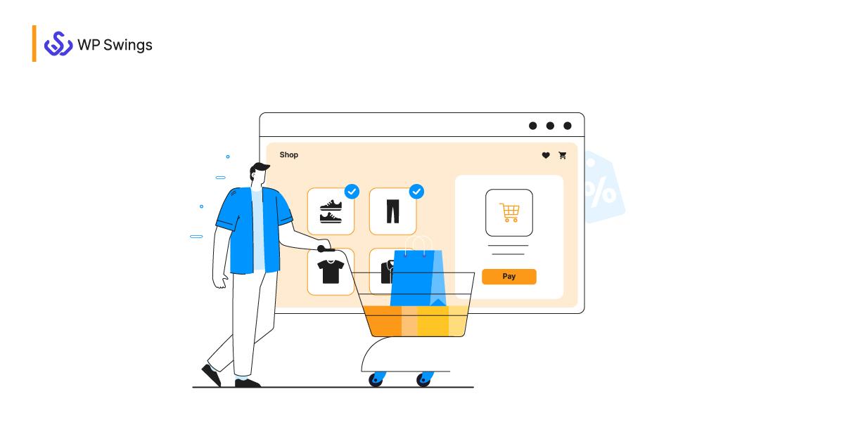
The moment a customer clicks “buy” should feel like the finish line - a brief, satisfying sprint after a longer journey of discovery. Instead, for many businesses it becomes an obstacle course: a slow page, a confusing form, a surprise shipping fee, or a forced sign-up that turns confidence into hesitation. Those last few steps, frequently enough treated as routine, are where the sale is won or quietly evaporates.
This isn’t about dramatic marketing failures or product flaws. ItS about tiny frictions and cognitive load piling up at the final moment of commitment. A checkout process is less a single page and more a series of micro-interactions; each one can either reinforce trust or introduce doubt. when these micro-interactions go wrong - even in small ways – they compound, lowering conversion rates and leaving revenue on the table.
In the pages that follow we’ll unpack the common culprits: slow performance,unexpected costs,poor mobile experiences,confusing navigation,and misplaced form fields. More importantly, we’ll look at practical fixes and testing approaches that transform checkout from a bottleneck into a conversion engine.Consider this the beginning of a careful diagnosis: not to blame, but to uncover and remedy the quiet issues that are killing conversions.
Friction in form design makes checkout feel like a chore: simplify fields use smart defaults and inline validation to reduce abandonment
Checkout should feel like the last kind handshake in a purchase journey, not a test of patience. When every field asks for more than your buyer is willing to give,conversion grinds to a halt – hesitation turns into abandonment. Common culprits:
- Too many inputs (why do you need my birthday?)
- Confusing required vs. optional fields
- Manual address entry with zero suggestions
- Generic error messages that appear after submit
These micro-frictions add up: each extra click or unclear prompt raises the cognitive load and chips away at trust.
Fixing the flow is less about redesigning the wheel and more about removing obstacles. Make it effortless:
- reduce fields to essentials and hide optional inputs behind progressive disclosure
- Use smart defaults (country by IP, shipping=billing toggle, currency based on locale)
- Enable autocomplete/autofill attributes and address suggestions to cut typing time
- Validate inline with clear, friendly messages so users can correct as they go
Small, sensible tweaks-paired with A/B tests-turn checkout from a chore into a quick, confident finish line.
Hidden costs and surprise charges destroy trust: display final pricing early offer shipping options and transparent fees before payment

Nothing kills checkout momentum like an unexpected extra charge. Shoppers forgive a long form or a slow page, but surprise fees feel like bad faith - and they leave your site before you can apologize.Make the final cost visible as early as the cart review, present shipping choices with price and delivery time, and itemize any handling or service fees so buyers never feel tricked. Small cues – a clear price badge, a shipping estimator, and an editable cart summary – turn doubt into confidence and reduce abandonment rates almost immediately.
- Show the final price before the payment step (include taxes and shipping estimates).
- Offer clear shipping options with cost and delivery date.
- Break down fees-don’t hide service or packaging charges in the fine print.
- Allow edits to shipping or items without restarting checkout.
- Use upfront microcopy to explain why a fee exists (e.g., “sustainability packaging”).
Make clarity measurable: a simple summary table in the cart can calm buyers faster than any promotional banner.
| Fee type | When to show | Expected effect |
|---|---|---|
| Shipping | On cart + checkout options | Lower cart abandonment |
| Taxes | Calculated before payment | Fewer surprises |
| Service/Handling | Line-item on order summary | higher perceived honesty |
Use clear microcopy, a bold refund policy link, and prominent progress indicators to reinforce trust – and never bury a charge where only the payment page can find it. Transparent fee labels are a tiny UX change that pays off in conversions and repeat buyers.
Slow or broken payment flows kill momentum: optimize load times add guest checkout and multiple familiar payment methods

Momentum is fragile: a one- or two-second delay at the moment of payment feels like an eternity to a buyer and translates directly into abandoned carts. Slow load times, clumsy redirects and payment validation errors break the emotional flow you worked so hard to create – and there’s no easy forgiveness at the end of the funnel.Prioritize measurable wins: trim JS bundles, serve critical payment UI from cache, defer third‑party scripts, and instrument timing so you can see where seconds are leaking away. Customers don’t care about your tech debt; they care about a smooth, trustworthy finish. Fast loads, friction‑free forms and clear trust cues are non‑negotiable.
Make it trivially easy for people to pay by offering choices and hiding complexity: enable a guest checkout, surface the few most familiar payment methods first, and gracefully recover from errors with clear inline messages and one‑tap retry options.Try these practical moves now:
- Guest checkout - remove required account creation and offer email receipts rather.
- Multiple familiar methods – cards, Apple/google Pay, PayPal, and local wallets where relevant.
- Sensible fallbacks – instant validation, saved card masks, and transparent 3DS flows.
| Method | Familiarity | Implementation speed |
|---|---|---|
| Card (Visa/Mastercard) | High | Fast |
| Apple/Google Pay | High on mobile | Medium |
| PayPal | High | Fast |
Mobile unfriendly layouts frustrate buyers: prioritize responsive design thumb friendly inputs and one tap actions
When checkout screens force users to pinch, zoom, or hunt for the pay button, frustration becomes the default emotion. Tiny form fields, cramped credit card inputs and off-screen buttons break the rhythm of buying – and break conversions. Prioritize fluid layouts that adapt to any screen width, place primary actions within the natural thumb reach, and design every input as a purposeful, touch-friendly step. Small details like input spacing, clear visual focus, and visible progress cues turn a clumsy mobile flow into a confident, one-handed experience.
Practical fixes that move the needle:
- Thumb-first placement: keep the primary CTA within the lower two-thirds of the screen for easy reach.
- Large touch targets: make buttons and inputs at least 44×44 px with generous padding.
- One-tap actions: support wallet payments,autofill,and tokenized cards to reduce typing.
- Adaptive fields: use input masks, single-field card entry, and smart defaults to speed completion.
| Element | Recommended | Why |
|---|---|---|
| Primary CTA | Bottom center, large | thumb reach & clarity |
| Form fields | 44-48 px height | Reduce mistaps |
| Payment options | One-tap wallets | Fewer drop-offs |
Complicated account requirements create drop off points: offer social login account creation after purchase and clear privacy reassurance
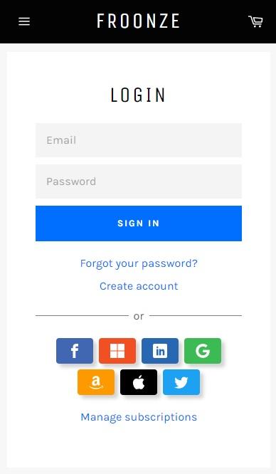
When checkout asks for a full profile before a single item is paid for, shoppers stall. Excessive fields,password rules and mandatory confirmations turn a tiny hesitation into a lost sale. Replace that wall with a lighter path: let people buy first and invite them to “save their order” afterwards via social login or one-click account creation. The payoff is immediate – faster completion, fewer abandoned carts and happier return customers – because the friction that kills conversions is moved to a moment when trust has already been earned.
- Reduce form fields at checkout
- Offer Google/Apple/Facebook sign-in post-purchase
- Make account creation optional and fast
clear privacy reassurance turns curiosity into consent. A brief, honest line of microcopy near the social-login buttons – and a visible link to concise privacy notes – removes doubt and boosts sign-ups. Use specific promises rather than vague legalese: tell customers what you store, why you store it, and how they can opt out. Examples of short trust lines that convert:
- One-click account: Create an account with Google - no password to remember.
- Privacy promise: We won’t sell your data or post without permission.
- Control: Manage or delete your account anytime in settings.
Poor error handling and vague messaging confuse users: provide inline error explanations clear next steps and automatic recovery paths
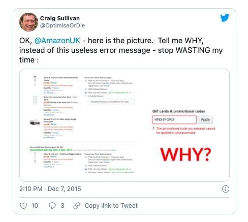
When a form hiccups, users don’t need a blame game – they need a hand. Replace cryptic red text with inline, human-friendly explanations placed next to the offending field so visitors can instantly fix the problem without hunting through the page. Practical cues matter:
- Empty card number: “Please enter the 16 digits shown on your card.”
- Invalid expiry date: “Looks like that date has passed – try MM/YY.”
- Server timeout: “We couldn’t confirm your payment right now.Your card was not charged.”
Each message should include the next tangible action-what the user should do-and a brief reassurance about safety or state (e.g., “your cart is saved”).
Design recovery like a concierge: anticipate slip-ups and offer clear, immediate remedies. Use a compact recovery table to make choices obvious and reduce friction:
| Problem | Quick Fix (what users see) | Automatic Recovery |
|---|---|---|
| Expired session | Button: “Restore session” | Save cart + refresh token |
| Payment declined | Tip: “Try a different card or PayPal” | Retry gateway with fallback |
| Address mismatch | Inline help: “check postal code” | Auto-validate and suggest corrections |
Make sure error text always answers three questions: What happened? What should I do now? what will you do for me? That clarity turns frustration into completed orders.
To Conclude
The checkout isn’t a necessary evil – it’s the final handshake between intent and action. If customers are slipping away at this moment, the problem is rarely fate and almost always friction: unnecessary fields, slow pages, unclear costs, or poor mobile experience. Treat the checkout like a microscope: inspect every step, measure real user behavior, and experiment with small changes that remove resistance. Audit your metrics, prioritize fixes that reduce clicks and cognitive load, and run A/B tests to validate what really moves the needle. Do that consistently, and the moment that used to kill conversions will become the moment your business finaly closes the deal.